A warm minimalist “quiet luxury” palette starts with a soft, light-absorbing base, then builds depth through layered neutrals rather than bold contrast. Begin by choosing one dominant wall color that reads calm in both daylight and evening light: warm white, creamy ivory, oatmeal, or a gentle greige. Avoid anything too icy or stark—cool whites can feel clinical and fight the “quiet” mood.
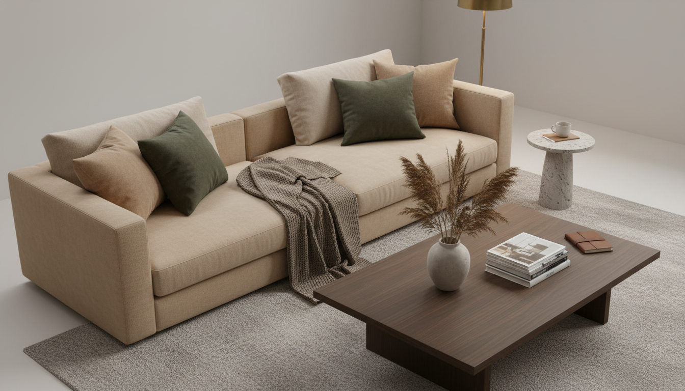
Next, pick two supporting neutrals that are slightly deeper than your base. Think mushroom, taupe, camel, sand, or a muted cocoa. These shades create dimension across upholstery, rugs, and drapery while staying understated. Keep the undertones aligned: if your base leans yellow/cream, stay in warm families; if it leans rosy or beige, choose companion tones with a similar softness.
To keep the look minimalist, limit the palette to 3–5 core colors and repeat them throughout the room. A practical formula is 70/20/10: 70% your base (walls and large surfaces), 20% a mid-tone neutral (sofas, rugs, bedding), and 10% a deeper accent (occasional chairs, trim, framed art, or a single statement piece). This keeps the space controlled and visually quiet, but not flat.
Warmth in quiet luxury often comes from materials as much as pigment. Pair your neutrals with natural textures—linen, bouclé, wool, oak, walnut, travertine, or unlacquered brass—to add richness without adding “color noise.” For a minimalist edge, choose matte or eggshell finishes and avoid high-gloss paint across large areas.
Finally, test paint and fabric samples in multiple lighting conditions. A color that feels serene at noon can turn muddy at dusk. Using two to three large swatches on different walls (and checking them next to your flooring) helps confirm that your palette stays warm, refined, and consistent.
For more examples and a step-by-step breakdown, visit the main guide on quiet luxury color palettes.
Muted accents like olive, charcoal, warm navy, or terracotta add depth without disrupting the calm. Use them sparingly in one or two pieces—pillows, a vase, or a single artwork—to keep the room feeling minimalist.


Leave a comment