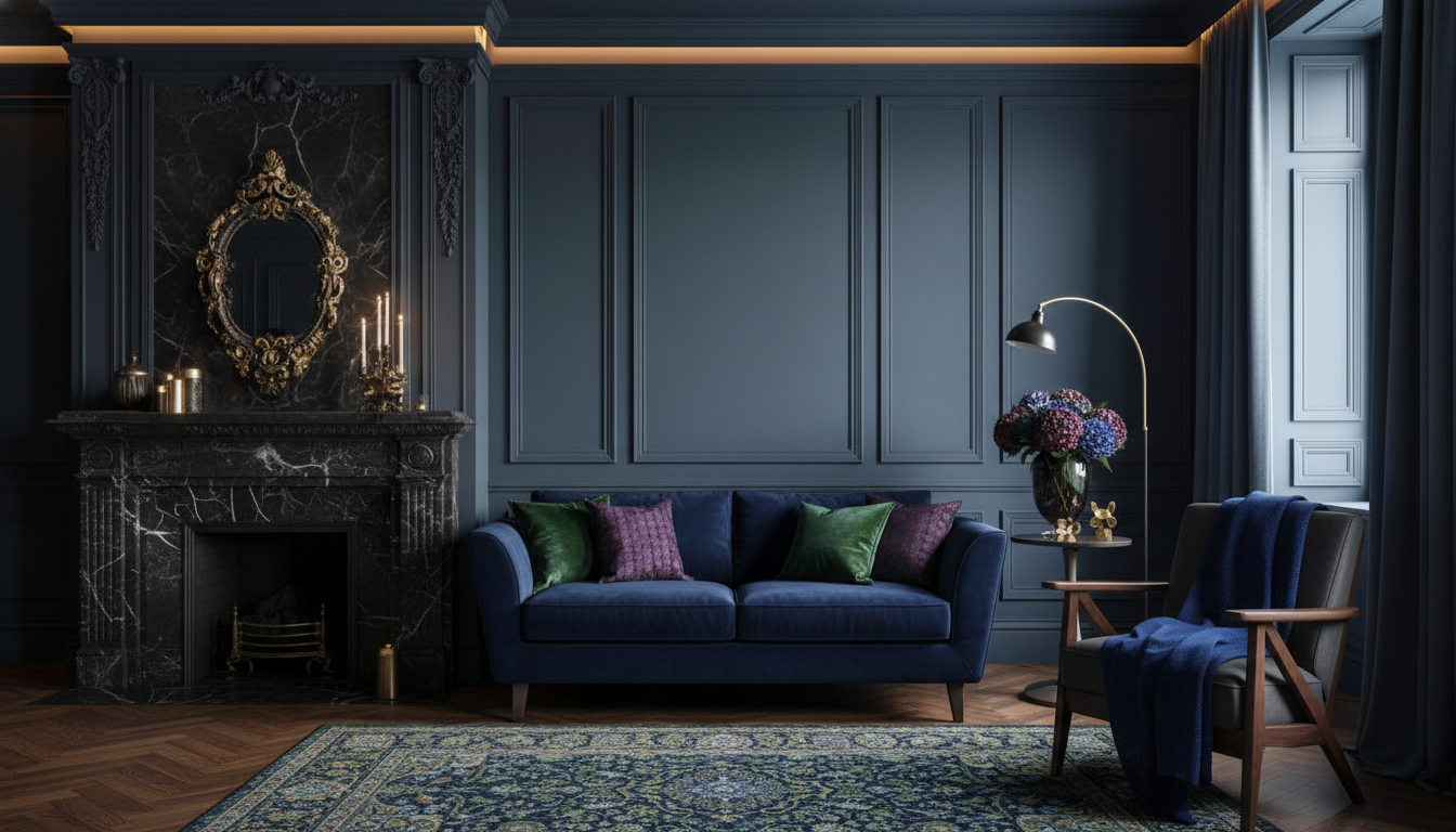
Jewel tones bring depth, drama, and a tailored feel to a space—especially when used as accents against calm neutrals and layered textures. When they’re chosen with intention (and kept to a clear “hero” color), these saturated hues read more like polished design than trendy color. Below is a room-ready guide to what jewel tones are, how to select the right shade for your lighting and finishes, and how to test your palette with AI before you commit to paint, upholstery, or decor. For more guidance, see [PDF] Interior Colour Combinations – extnag.tacc.utexas.edu.
Jewel tones are saturated, gemstone-inspired hues that look rich rather than loud. Think emerald, sapphire, amethyst, ruby, garnet, and topaz/teal families. They feel luxurious because they mimic the visual depth of natural materials—stone, velvet, lacquer, and stained woods—so they hold their own under layered lighting instead of flattening out. For further reading, see The Color Palette Rules Every Cohesive Interior Quietly Follows.
The most elevated rooms typically use one dominant jewel tone supported by neutrals, then finish the look with a controlled metal or wood note (rather than mixing every finish in the room).
| Jewel tone | Accent ideas | Best neutral partners | Metal/wood notes |
|---|---|---|---|
| Emerald green | Velvet pillow, ceramic lamp, art print | Warm white, greige, charcoal | Brass, walnut, smoked oak |
| Sapphire blue | Rug border, drapery, painted cabinet | Crisp white, taupe, deep gray | Polished nickel, blackened steel |
| Amethyst purple | Bouclé pillow, glass vase, bedside throw | Stone, linen beige, soft gray | Aged brass, light oak |
| Ruby red | Lacquer tray, floral arrangement, accent chair | Cream, camel, espresso brown | Antique gold, dark wood |
| Garnet/burgundy | Ottoman, bedding, dining chair upholstery | Ivory, putty, charcoal | Bronze, walnut, cognac leather |
| Topaz/teal | Statement art, bathroom tile detail, throw blanket | Warm white, sand, slate | Brass, rattan, medium oak |
Start with what you can’t easily change: flooring undertone (warm vs. cool), major upholstery, and large wood pieces. Color temperature matters because jewel tones intensify under warm bulbs and can skew cooler near north-facing light. For a practical primer on temperature and perception, see X-Rite’s overview of color temperature.
For clarity, choose one “hero” jewel tone per room. A second jewel tone can work, but keep it as a small echo—an art detail, a single vase, or a thin stripe in a rug—so the room still feels composed.
Fabric choice is what makes jewel tones feel intentional. Velvet and silk look luminous because they reflect light in a dimensional way; linen and cotton read relaxed and airy; leather looks tailored and architectural. If you’re selecting a specific hue, referencing standardized color systems can help you communicate shade accurately—see Pantone’s color system overview for how color families are categorized.
Two reliable contrast formulas keep jewel tones sophisticated:
For a designed rhythm, repeat the jewel tone two to three times at different heights—something near the floor (a rug border), something at mid-level (pillows or a chair), and something higher (art). Keep patterns disciplined: one patterned feature (rug or drapery) plus solids elsewhere prevents the room from feeling busy while still feeling layered.
Keep the sofa neutral for longevity, then add jewel-tone pillows plus one statement object (a lamp base or sculptural vase). Tie it together with art that includes the same hue so the color feels “built in,” not sprinkled around.
A substantial wood piece also helps anchor saturated accents; a streamlined option like the Modern Solid Wood 6-Drawer Dresser with Gallery-Top can balance richer bedding without competing with it.
Upholstered chairs in garnet, sapphire, or emerald instantly elevate a dining area. Keep tableware simple and let warm wood tones do the supporting work. If you want a fast upgrade that still feels clean-lined, consider the Modern Dining Chairs Set of 6 and bring in jewel color through seat cushions, a runner, or artwork.
Think “small but impactful”: bar stools, a painted island, or curated countertop decor. Jewel tones in kitchens look best when the rest of the palette is restrained—clean neutrals, consistent hardware, and minimal pattern—so the space still feels fresh and easy to maintain. For flexible function that works with many palettes, the 47″ Kitchen Island Cart with Storage, 2 Drawers & Rolling Buffet Sideboard Cabinet can add storage while you keep color focused in accessories.
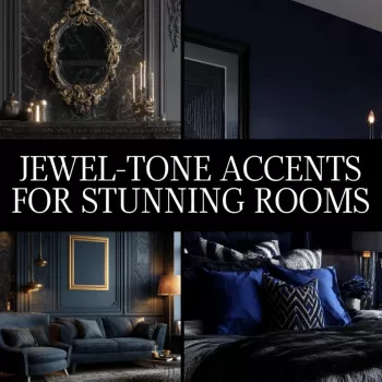
For a more structured set of combinations that’s designed to work well with visualization tools, explore Jewel-Tone Accents for Stunning Rooms (digital download).
Jewel accent colors are saturated, gemstone-inspired hues such as emerald green, sapphire blue, amethyst purple, ruby red, garnet/burgundy, and topaz/teal. They’re typically used in smaller doses against neutrals to add depth and a more luxurious, tailored look.
Jewel tones look deep, rich, and high-saturation, often with a slightly shaded, luminous quality rather than a flat brightness. They appear especially dimensional on materials like velvet and lacquer and under layered lighting.


Leave a comment